Jewel tones and calming textures from the Dulux Colour Forecast 2027

Jewel tones and tactile, calming rooms are two answers to the same busy world
Picture two rooms. In one, deep berry and gold walls wrap around you and a gloss-painted door catches the evening light. In the other, soft green walls, honed stone and timber you want to run a hand over, with a pot of tea on the go.
They look nothing alike, but both are about a home that feels personal and slows you down. Dulux, whose Colour Forecast 2027 covers both, frames them as a move away from “perfection-driven and digitally curated living”.
Jewel tones
Jewel tones are having a real moment. The Pantone Color Institute sends a team to Milan Design Week every year to see where colour is heading, and at the 2026 fair ruby, garnet and amethyst stood out.
These were deep, heavily pigmented reds and purples, often with a cool blue undertone, and they were layered one over another rather than used on their own. Pantone’s Jane Boddy called it “a modern interpretation of opulence”.
The finish mattered as much as the colour. Boddy saw high-gloss and lacquered surfaces make the shades glow, while matt finishes made them look fuller and deeper. Against a dark background they looked richer still.
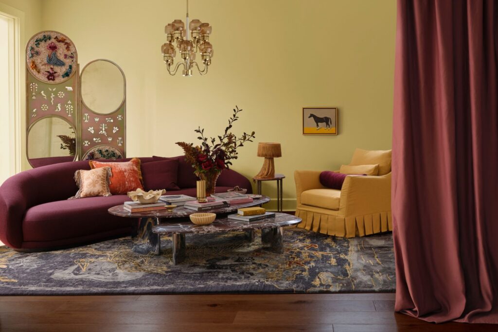
The Dulux Colour Forecast 2027 brings that richness home in its Treasure palette. Dulux calls it a shift away from stark minimalism towards “restrained maximalism”, favouring depth over decoration.
“Dulux Treasure invites us to layer our homes with stories and materials that echo our identities,” says Davina Harper, Colour & Design Specialist at Dulux New Zealand.
The palette pairs two berries, Omaui and Danseys Pass, with a deep blue called Precision and a smoky purple called Whangaroa. Golds such as Dipton and Arrow River bring warmth, and a teal called Plunge adds contrast.
In the forecast’s styled rooms, by stylist Bree Banfield and photographer Lisa Cohen, one room wraps the walls and ceiling in gold with a berry wall in front. Another sets a purple wall against deep blue window frames, architraves and skirting.
Dulux describes the effect it’s after as enveloping, and its rooms get there by carrying colour onto the trims and up over the ceiling rather than stopping at a single feature wall.
Gloss is part of it, as it was in Milan. Dulux says high-gloss finishes bounce light around a room and can lift both the sense of space and the atmosphere. It suggests starting with a gloss white such as Mt Hutt on a door, cabinetry or the ceiling, then going bolder with a berry.
Velvet, drapery, marble and mixed metals finish the look. Patina is welcome, and nothing has to look new.
Texture and calm
The other direction is about touch. Boddy saw it in Milan too, in clay tones and pinkish browns carried through clay, red marble, naturally dyed textiles, rugs and matt surfaces. “Texture was key,” she wrote.
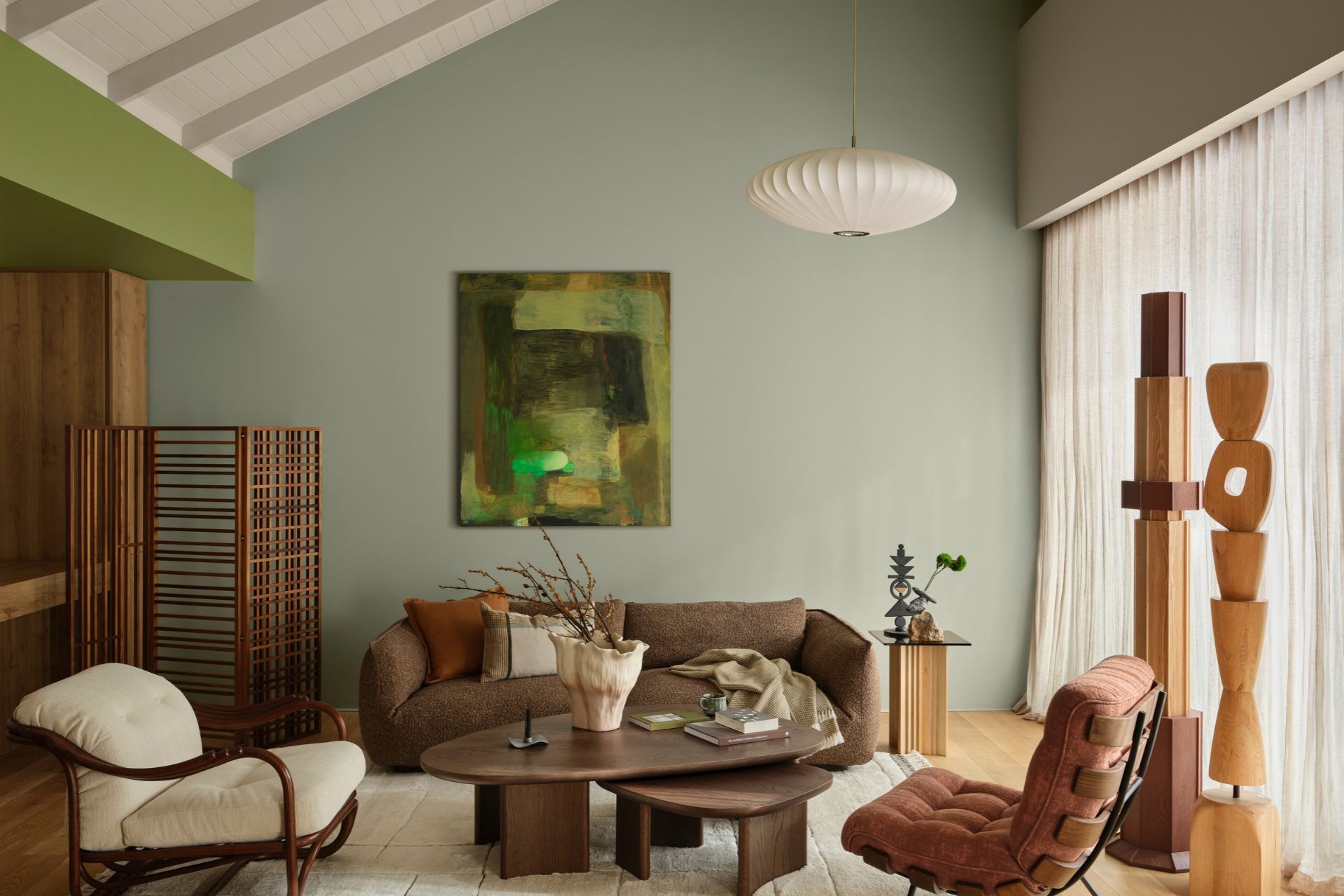
Dulux’s Sensory palette is made for rooms like that. It calls Sensory a tribute to mindful living, shaped by Japanese restraint and craftsmanship, and built around small rituals like lighting candles, making tea and breaking bread together. The colours are botanical greens such as Willow Flat and Puketī Forest, earthy browns Waipoua Forest and Tongariro, a light coastal blue called Puhoi and a warm wheat called Darfield.
In Dulux’s styled rooms, walls in Matakanui, a muted tan, sit under a Tongariro ceiling, and Grahams Beach green walls rise to Puketī Forest on the upper wall and ceiling.
Texture does as much work as colour. Dulux points to honed stone and wood grain, which soften sound, along with refined weaves, smoked glass, textured tiles and brushed brass. Sculptural furniture and handmade pieces suit it, and so do tea sets, candles and ceremonial seating.
“We’re seeing a renaissance of gentle grids and Japanese-inspired latticework, bringing quiet order, balance and a sense of intention to interiors,” says Davina.
Where to start
Both looks can start with a single room. For a calm, tactile space, Dulux suggests warm walls in Darfield, with greens and soft blue brought in through furnishings and accessories. A
limewash or plaster-look finish on one wall adds texture, and a wool rug or linen curtains will do the same.
For jewel tones, a gloss-painted door or cabinet is a low-risk first step. If you want more, pick one deep colour and take it over the walls, trims and ceiling the way Dulux’s stylists did.
Jewel-toned rooms are built in layers, so there’s no rush to finish it in a weekend. Test a sample pot in your own light before you commit.