Dulux Colour Forecast for 2025
Dulux has unveiled its Colour Forecast for 2025, and it’s all about finding joy and comfort in the spaces we call home. After years of uncertainty and change, many of us are looking to our surroundings for a sense of stability and peace. Dulux’s new palettes are here to help us do just that, with colours that feel like a warm hug at the end of a long day.

Exploring 2025’s Palettes
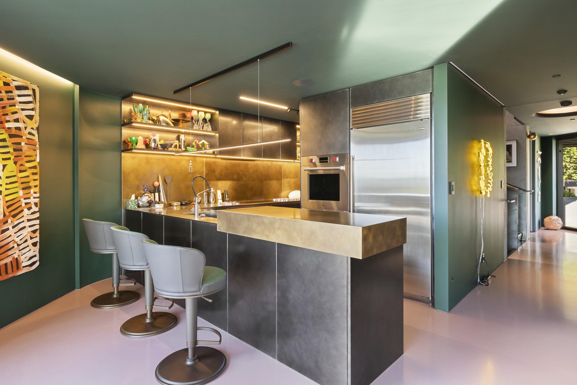
The 2025 Colour Forecast is divided into three inviting palettes: Still, Recollect, and Emerge. Each one has its own personality, but they all share a common goal—to make our homes feel more like the comforting retreat we crave. The warmth of brown undertones runs throughout, adding a touch of nurturing positivity to our living spaces. Imagine rich burgundies and wine hues that wrap a room in elegance, or the calming presence of greens like olive and sage that connect us to nature. Even the more vibrant yellow-green shades bring a playful energy that lifts our spirits.
Behind this thoughtful collection is the Dulux Colour Team, including Colour Specialist Davina Harper, Colour and Communications Manager Andrea Lucena-Orr, and Colour Forecaster and Stylist Bree Leech. Their work isn’t just about picking colours that look nice—they dive deep into what these colours mean for us. They attend events like Milan Design Week, talk to global brands, and tap into insights from Europe and the Asia Pacific to bring us shades that resonate with our lives right now.
In times like these, when the world feels a bit shaky, we naturally gravitate towards colours that make us feel grounded. That’s why we’re seeing a rise in warm neutrals and soft greys. These muted tones offer a gentle escape from the hustle and bustle, giving us a sense of calm when everything else seems a little too much. But it’s not all about playing it safe—there’s room for fun too. Brighter colours are making a comeback, adding joy to our interiors. Think of pinks with a hint of brown that makes them cosy and versatile or the unexpected pop of lilac and purple that adds a bit of whimsy without feeling too loud. Even blue is getting a fresh twist, with purple undertones bringing a new level of depth and sophistication.

Revitalising Your Space With Dulux
These palettes are designed to work together effortlessly, giving us the freedom to mix and match. Whether you’re looking to refresh a single room or do a complete home makeover, these colours can inspire confidence and creativity. They remind us that our homes are personal spaces—places where we can express who we are and what makes us happy.
Dulux ambassador Evie Kemp captures the essence of these trends beautifully. “The trends for Spring 24/Summer 25 are optimistic, joyful, and comforting,” she says. “We’re seeing sunny colours used in playful ways, lots of curves, soft shapes, and textures.” Kemp describes how these trends might feel youthful, but the Dulux Emerge palette takes them to a more sophisticated level. It’s all about sustainability and nods to classic design eras, showing us that we can have fun with colour while still keeping things timeless and elegant.
“The reason we come back to colours like these in times of renewal is for how they make us feel,” Kemp continues. “They’re almost infectious in their positivity without being saccharine.” Her favourite shades from the Emerge palette—like the dusky mauve of Dulux Mechanics Bay or the vibrant yellow of Dulux Hagley Park—show how colour can create a space that’s both serene and surprising. These colours make a room feel alive, full of personality, and perfectly imperfect.

Evie Kemp’s Colour Advice
For anyone feeling a bit hesitant about diving into new colours, Kemp offers some reassuring advice. “The Colour Forecast is such a great way to get inspiration and stretch your colour boundaries with combinations you might not have originally thought of,” she says. “Think about how they make you feel and how you might be able to bring them into your own home.” A simple starting point might be painting a piece of furniture in one of the forecast’s accent colours. “It usually leads to a whole room redesign—I’m not mad about it,” Kemp says.
What Dulux’s 2025 Colour Forecast really offers is an invitation to make our homes a reflection of our lives. As we seek out spaces that feel more personal and more comforting, these colours remind us that the right shades can transform how we feel every day. Whether it’s the calming neutrals of the Still palette, the nostalgic hues of Recollect, or the vibrant optimism of Emerge, there’s something here for everyone. So why not take a step outside your comfort zone? Try a colour that makes you smile every time you walk into the room. After all, our homes are the places where we can truly be ourselves—and with the right colours, they can become the sanctuary we all need.
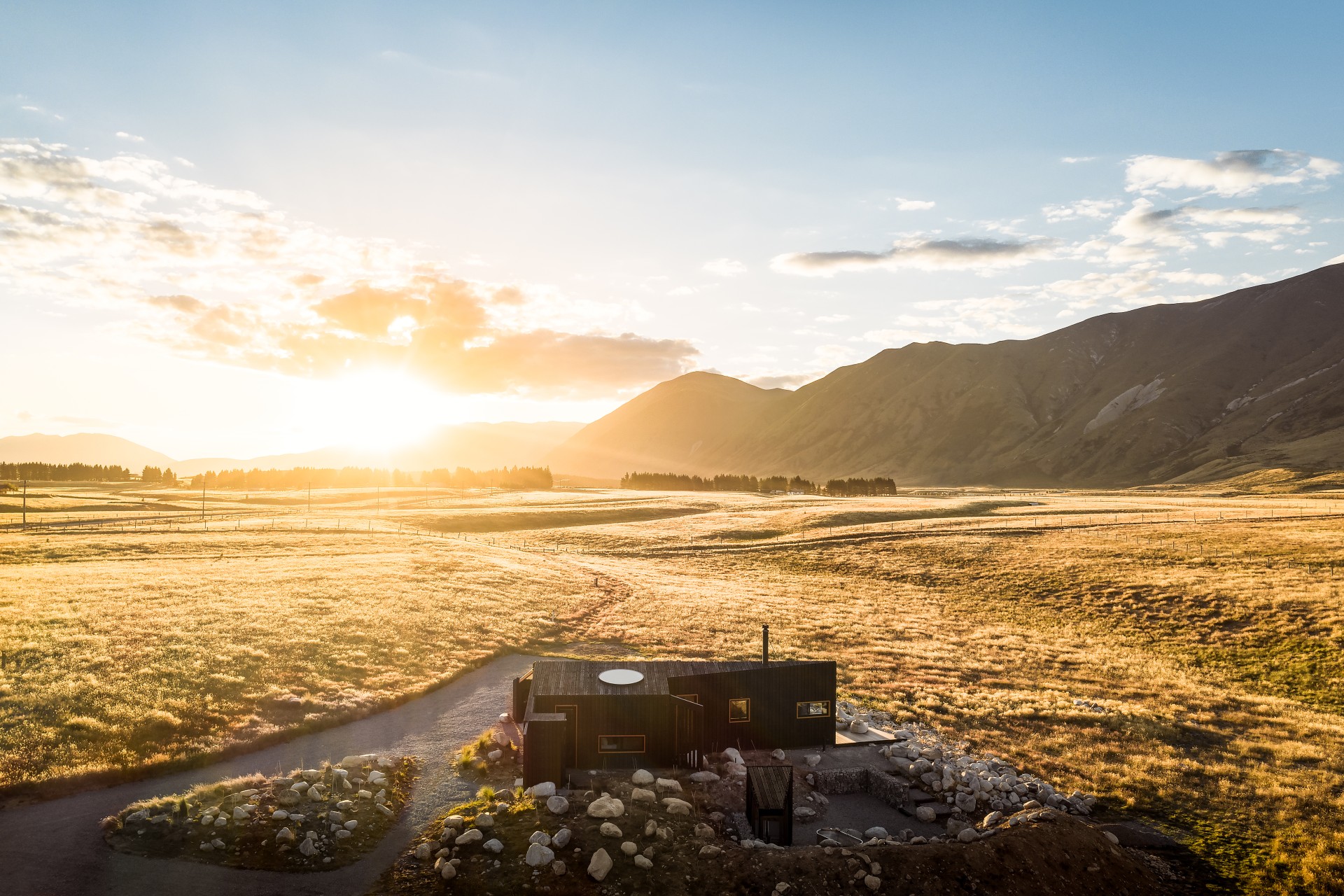
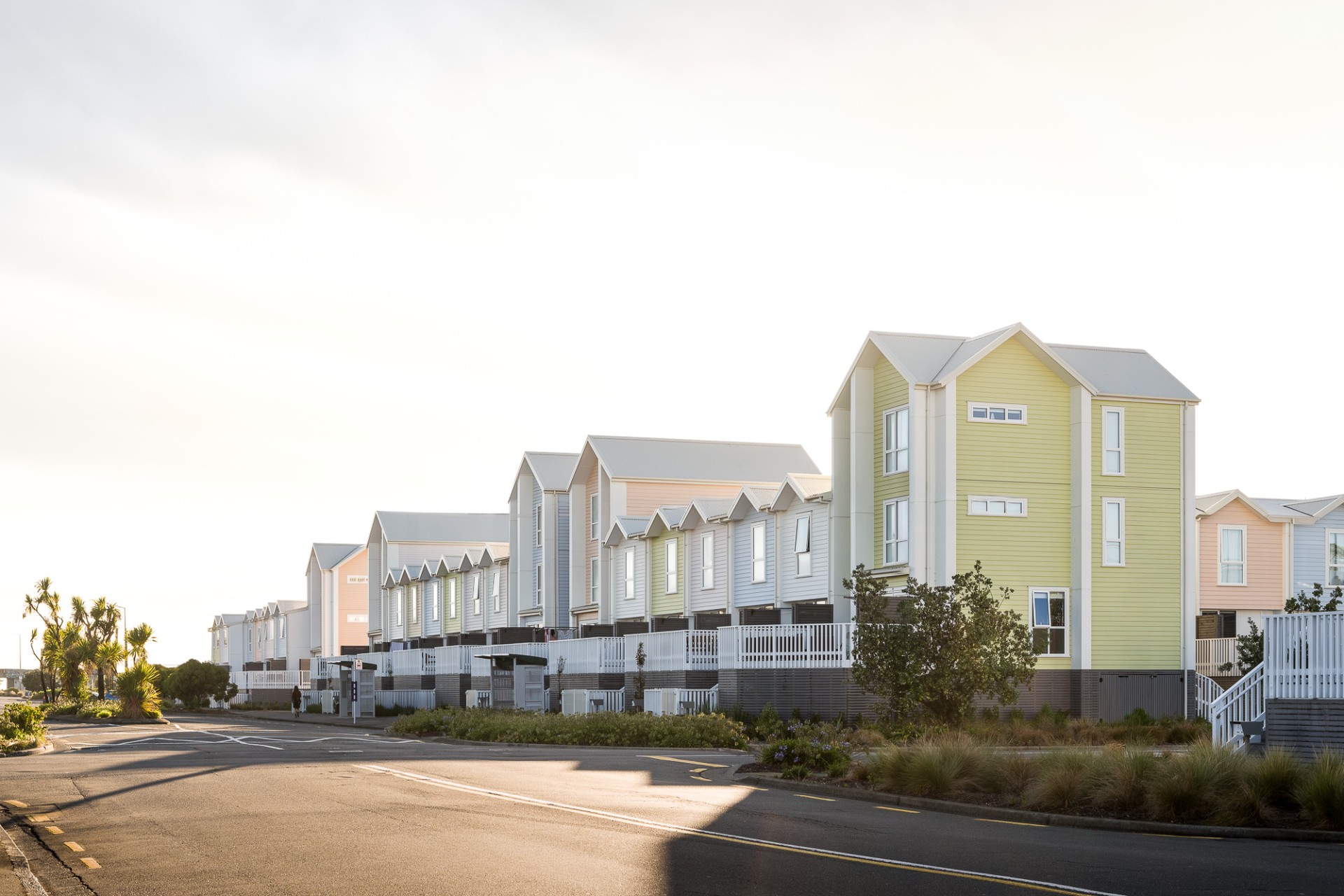
Photos provided by Dulux