New ‘Down to Earth’ kitchens
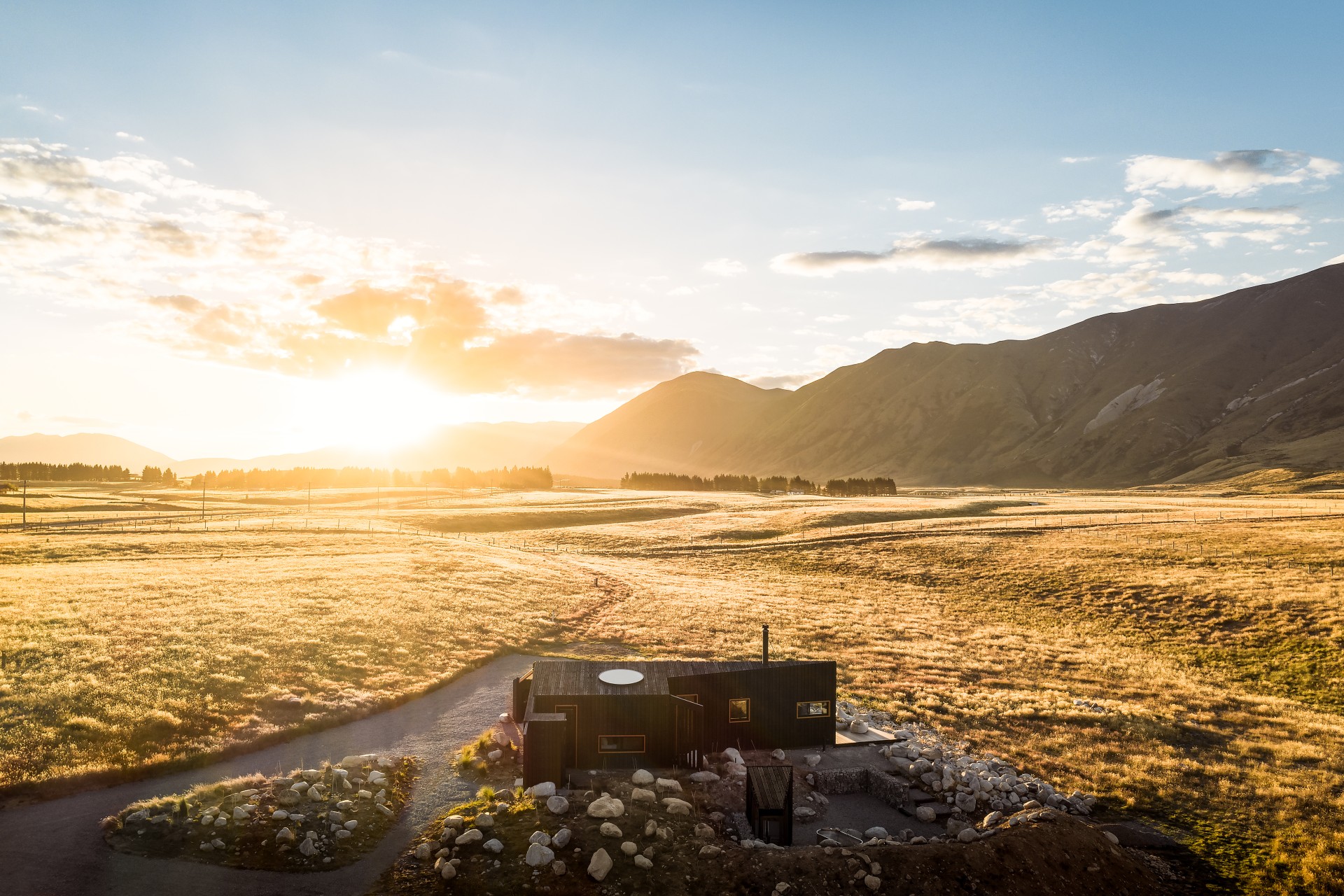
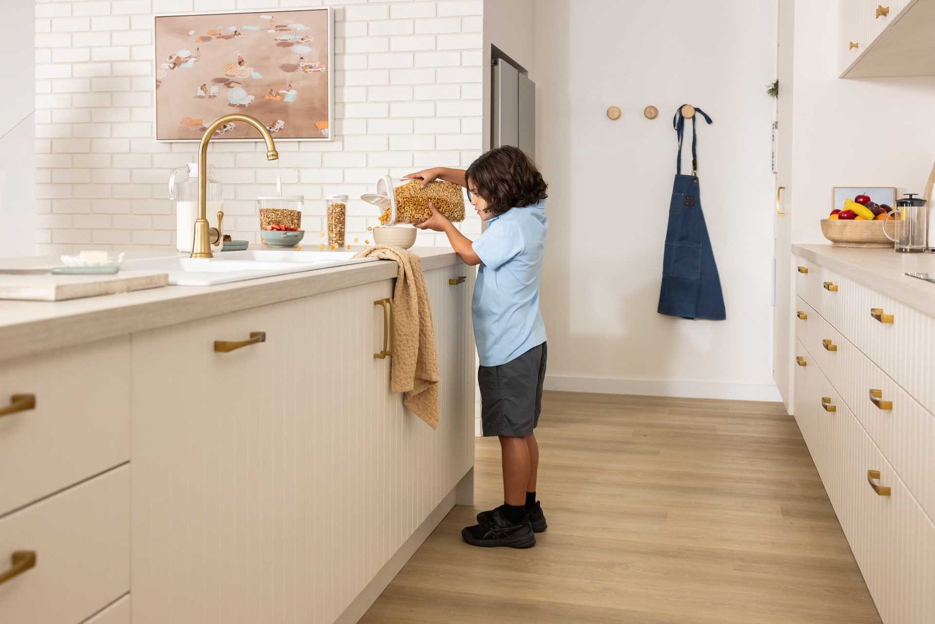
If there’s one thing we could all use a little more of, it’s calm. Between the constant buzz of modern life and the endless to-do lists, home should be the one place where you can truly take a breath. That’s exactly what Kaboodle had in mind when creating their latest Trends Range, called Down to Earth.
But this isn’t just a splash of new colour for colour’s sake. This new colour collection is all about grounding tones, soft textures, and that sense of “ahhh” you get when you walk into a space that just feels right.
Timeless kitchen design
Backed by two years of global and local trend research, the range is the result of the Kaboodle team tracking shifts in design thinking, attending major events like EuroCucina in Milan, and absorbing insights from industry leaders like WGSN. The result? A carefully curated palette that feels timeless yet undeniably current.
“We’re not just following trends, we’re anticipating them,” says Kaboodle Marketing Manager John Harrison. “By tapping into global conversations and local creative voices, we’ve built a range that feels timeless but totally of the moment.”
This is a range for people who want their home to feel calm, lived-in, and inviting. The colour palette is inspired by nature’s grounding elements: think clay, stone, moss, and sand. These hues aren’t loud or flashy, they’re designed to feel, not just be seen.
“The colours we live with shape how we feel,” says Harrison. “This palette invites mindfulness and presence. It helps make home a place to reset.”
With wellness and mental clarity becoming key drivers in interior design, Kaboodle’s trend-forward, yet comforting colours tap into a universal need for spaces that soothe.
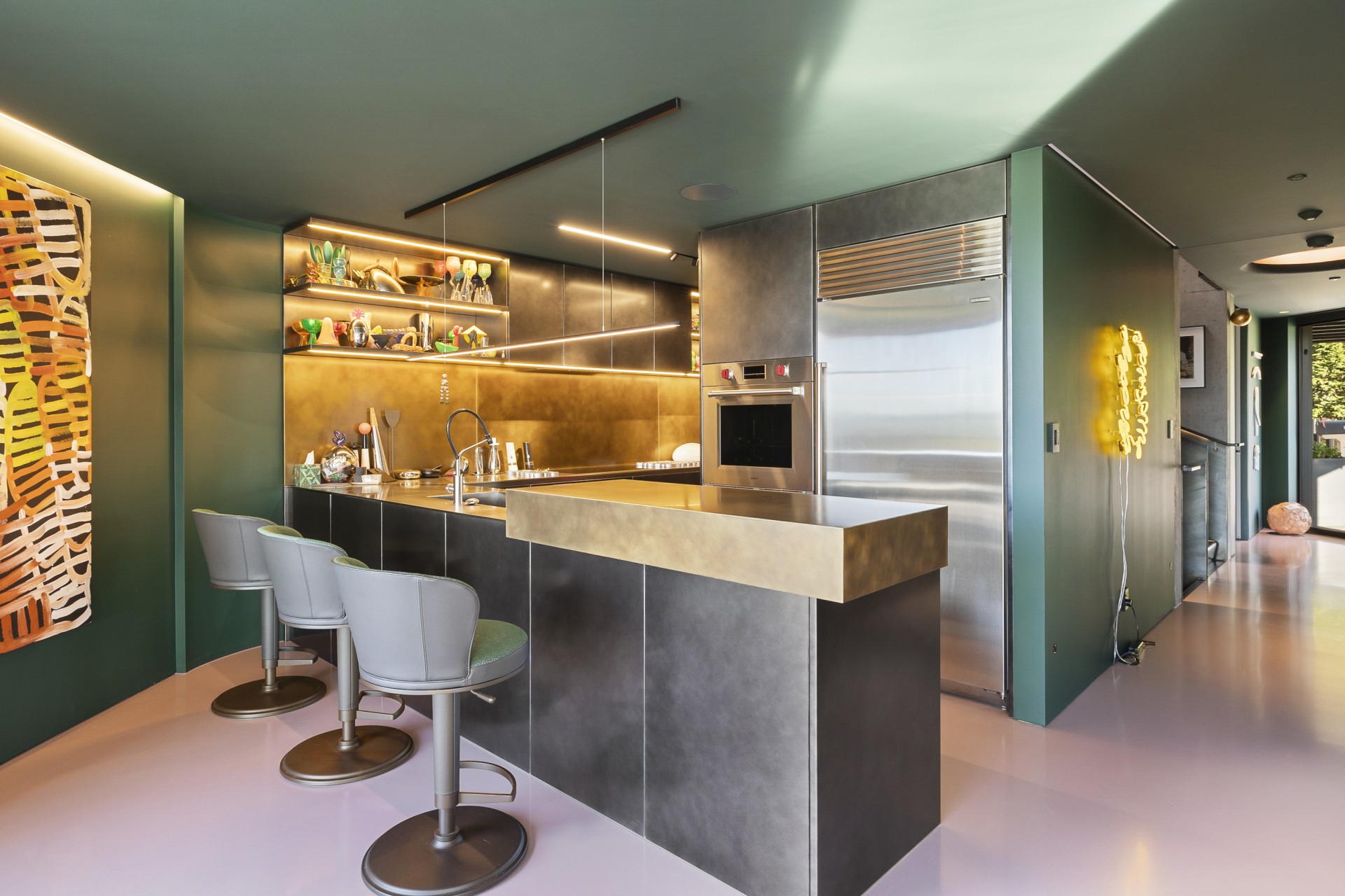
Meet the colours
Each shade in the Down to Earth collection carries its own personality and purpose. Whether you’re designing a full kitchen or refreshing a laundry or home office, there’s something in this range that invites connection and calm:
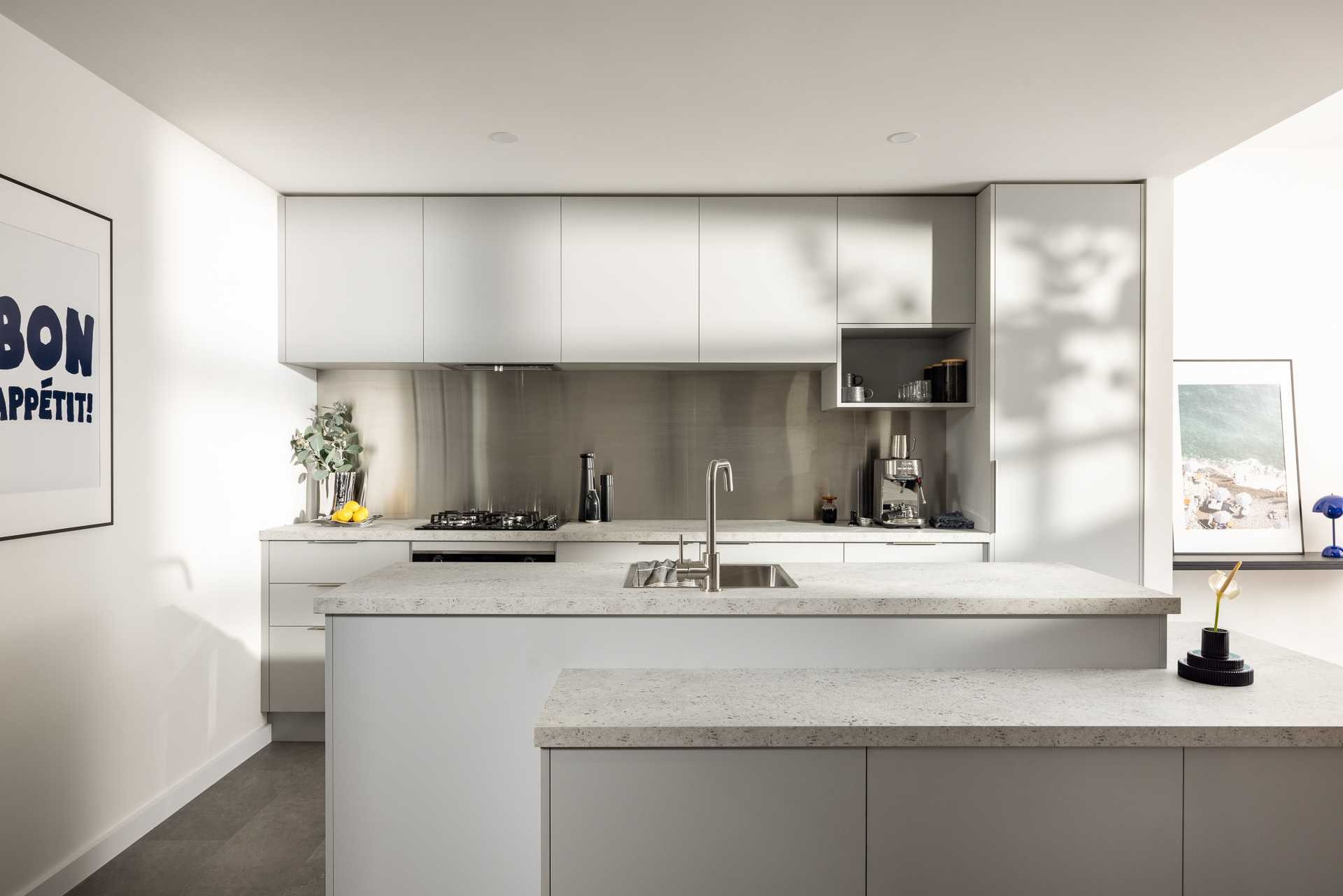
· Oyster – A gentle, soft grey with subtle silver undertones. It’s clean, minimalist, and perfect for anyone chasing serene simplicity.
· Saltbush – An earthy, muted green that feels both luxurious and understated. This one adds a natural warmth without overwhelming a space.
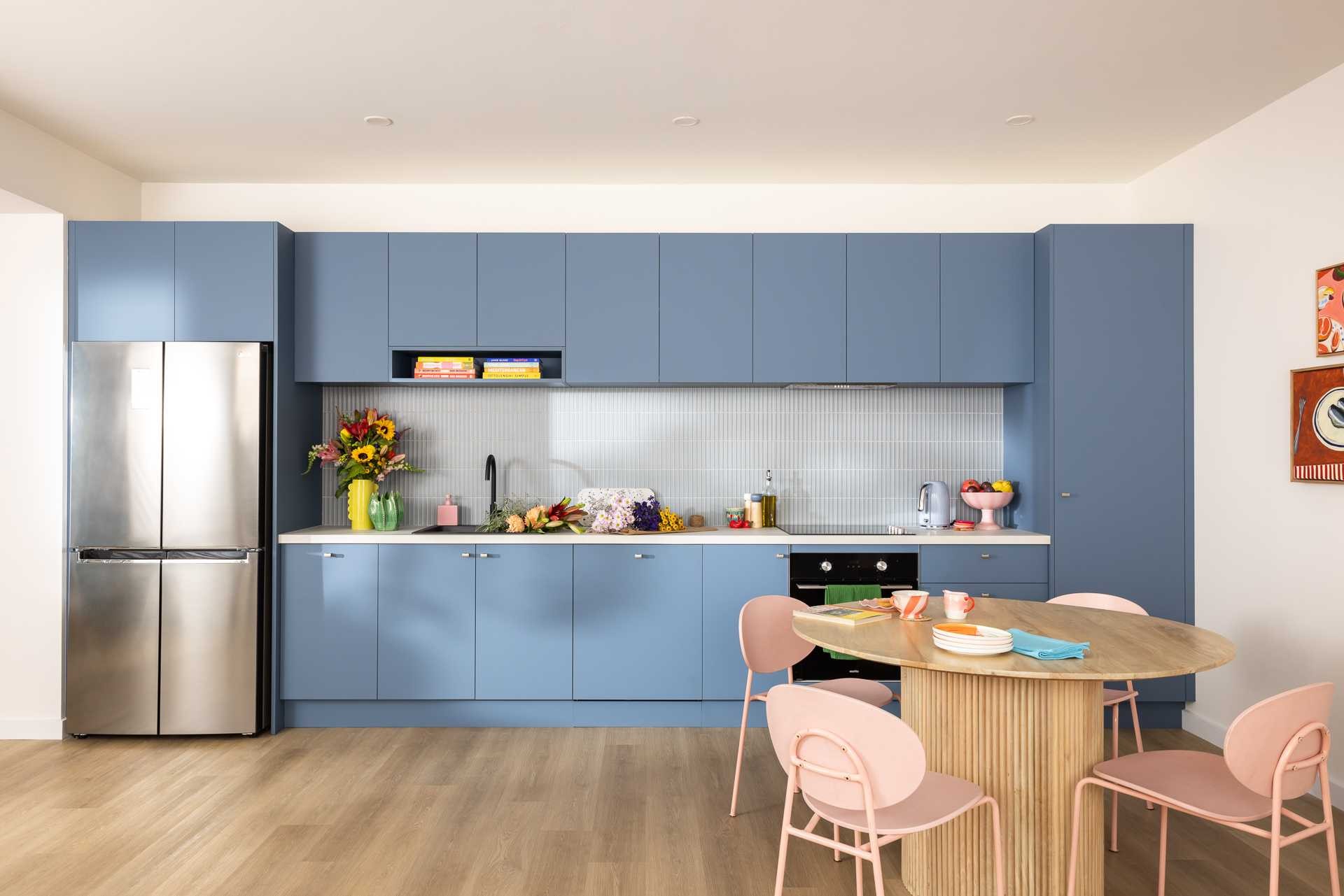
· Juniper – A misty blue that leans into calming grey. Think ocean haze on a quiet morning, ideal for a tranquil home oasis.
· Cannellini – A sandy beige that instantly warms up a room. It’s soft, grounding, and incredibly versatile.

· Pistachio – A fresh, green-grey hue that strikes a balance between contemporary edge and natural energy.
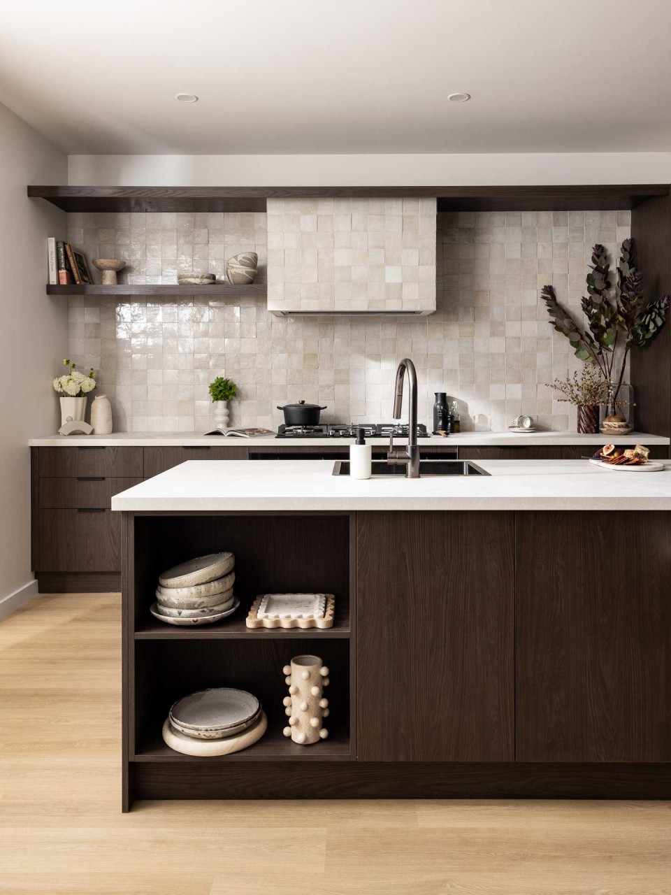
· Truffle Oak – A timber-look finish with deep cool tones and textured woodgrain. Decadent yet earthy, this is for those who love timeless elegance with a twist.
Kaboodle has also made it easy for homeowners to explore and experiment with these new tones. Their free online design planner tool lets you visualise the palette in your space, helping you make decisions with confidence.
Whether you’re starting from scratch or updating a few key pieces, Down to Earth gives you the flexibility to create something that’s both beautiful and personal.
To explore the full collection or try the planner, visit kaboodle.co.nz.
Photos supplied by Kaboodle Kitchens