Cloud Dancer named Pantone Colour of 2026
The Pantone Colour of the Year is…white?
PANTONE 11-4201 Cloud Dancer has been named the colour of 2026. Dubbed a serene hue to inspire focus, an unassuming backdrop meant to ground us in a chaotic world, it’s certainly a unique and surprising colour choice.
Pantone’s yearly colour announcement is always hotly anticipated. The “billowy, balanced white” was picked for 2026 to inspire serenity and softness.
“A whisper of tranquillity and peace in a noisy world”, the intention is for quiet reflection that allows the mind to wander.
The “global colour authority” has not picked a white hue since it started naming colours in 1999.
“We wanted to draw attention to the relationship between culture and colour,” Laurie Pressman, Vice President of the Pantone Colour Institute, said.
“We wanted to highlight to our audience how what is taking place in our global culture is expressed and reflected through the language of colour.”
“Similar to a blank canvas, Cloud Dancer signifies our desire for a fresh start. Peeling away layers of outmoded thinking, we open the door to new approaches.
“An airy white hue, PANTONE 11-4201 Cloud Dancer opens up space for creativity, allowing our imagination to drift so that new insights and bold ideas can emerge and take shape.”

Cloud Dancer in key spaces
The Pantone Colour of the Year 2026 was also chosen for its adaptability, which can soften bolder tones or heighten the warmth of earthier hues.
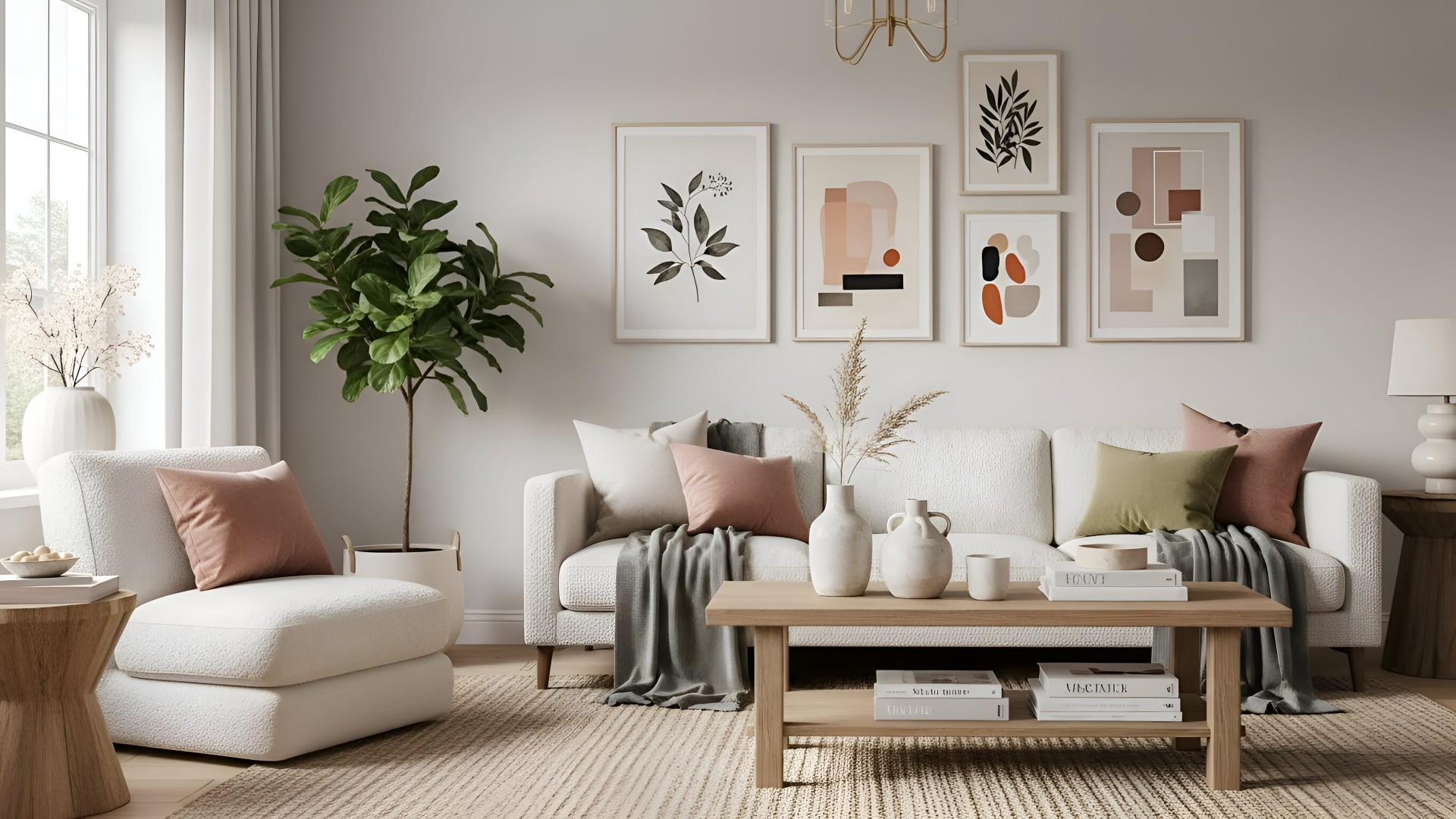
Paired with muted greens, gentle blues, warm clays, and neutrals, it aims to evoke restorative calm, ideal in interiors seeking to balance natural textures with the understatement typical of a modern design approach.
When set alongside richer colours like deep reds and inky navies, Cloud Dancer takes on a gallery-like quality, creating negative space that allows surrounding colours to shine vividly.
Pantone encourages designers to see the colour as well-considered and intentional rather than a gap filler.
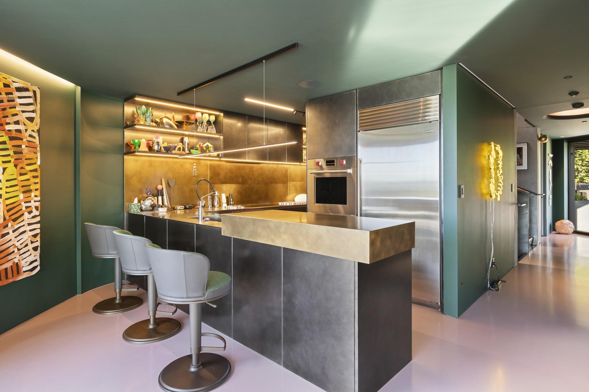
In homes, it lends itself to spaces like light-washed living rooms and minimal kitchens, meditative bedrooms and retreat bathrooms.

How to pick the right white
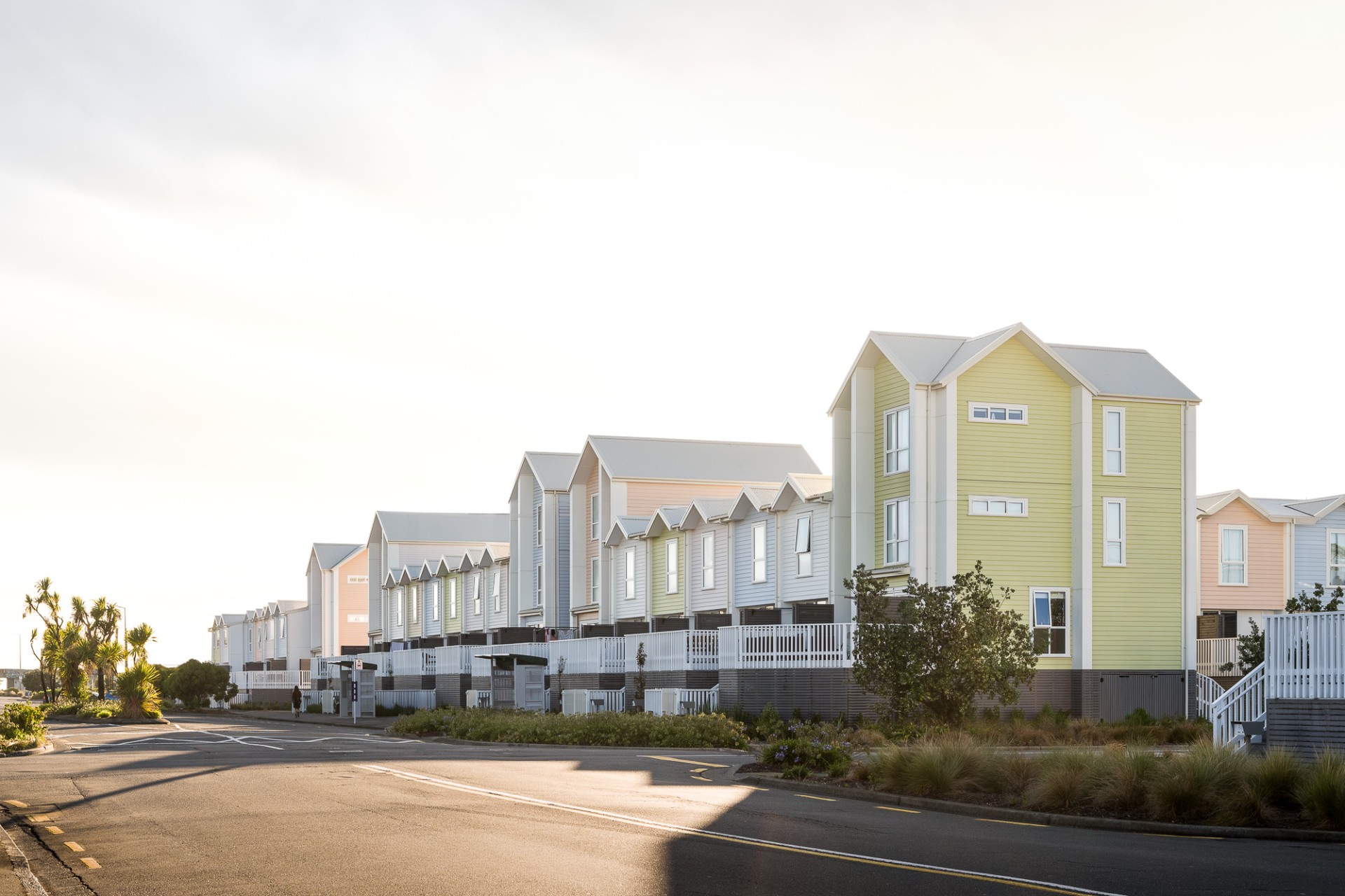
The most popular colours in New Zealand homes are white. Choosing the right tone can be a laborious decision.
Let there be light
One thing to consider is how the light hits in the room. In a north-facing room, it might help to pick a warmer white with a soft yellow undertone to offset the grey light.
South-facing rooms tend to get strong, warm daylight, so they can handle crisper, cleaner whites without feeling stark and clinical.
East-facing rooms soak in the morning before cooling off later in the day, so a balanced, neutral white is typically the most stable choice.
West-facing rooms absorb the golden hour. Intense afternoon light can make warm whites appear too yellow, but a slightly cooler white balances the warmth.
Small swatches are misleading; paint large A3-sized patches or brush the colour directly onto the wall.
Then spend a full day watching how the colour shifts from morning to night, and how it behaves with lamps or overhead lighting.
The colour you love at midday might look dull at dusk or unexpectedly yellow under warm bulbs. Seeing it in context is the only reliable way to choose.
Atmosphere and undertone
It’s no wonder people take time to pick the exact white hue they wish to paint their interiors. The undertone has such a profound impact on how your room ultimately comes together.
Even if a white hue looks plain at first glance, it leans warm, cool or neutral. Warm whites with hints of yellow and cream create a sense of comfort. Cool whites feel modern and crisp. Neutral whites sit in between.
If you place the white swatch beside a sheet of plain printer paper, then you will see the subtle differences.
Think too about the atmosphere you want the room to convey. If you’re after a bright, gallery-like effect with sharp edges and clean lines, a cool or neutral white reinforces that modern clarity.
For spaces meant to feel soft, calm and lived-in, a warm white is much more forgiving and flattering.
If you prefer something minimal without it feeling cold, a neutral white with a whisper of warmth keeps the room serene but still fresh.
The emotional tone of the space is often what helps break the tie between two similar colour samples.
Context and texture
You’ve got to consider which items in your home the white will be sitting against.
Floors, benchtops, tiles and furniture all carry their own undertones, and the wrong white can clash surprisingly quickly.
Warm timber floors, natural fibres and brass accents tend to work best with warm whites as they enhance their softness.
On the other hand, cool surfaces like concrete, pale oak, stainless steel or grey textiles usually pair more naturally with cool whites that echo their clarity.
So, if your home features a mix of warm and cool materials, a more neutral white acts as a middle ground. Cohesion can be tricky, though. Thinking of cabinetry, say, matching undertones is far more important than matching brightness.
Texture can also shift the way a white reads. Matte finishes absorb light and soften the colour, ideal for older walls or spaces where you want a calm, enveloping effect.
Low sheen or eggshell brings a gentle glow that works well in living areas. Gloss, especially on trims, reflects light sharply and can make the same white appear brighter or more intense.
That interplay between texture and tone often defines whether a space feels elegant, clinical, cosy or contemporary.