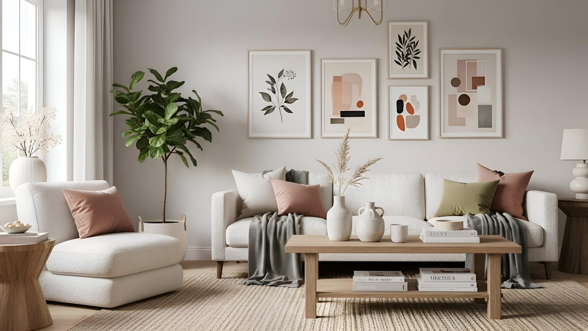
The second-best colour in the room
Most people pick a room’s colour by choosing the wall colour. They stand in front of a fan deck at a paint shop, settle on a hero shade, and assume the rest will follow. It usually does not. The room that reads beautifully a year later is almost never carried by its hero colour. It is carried by the more subtle tone sitting beside it: the trim, the joinery, the ceiling, the soft furnishings. The second-best colour is doing the work.
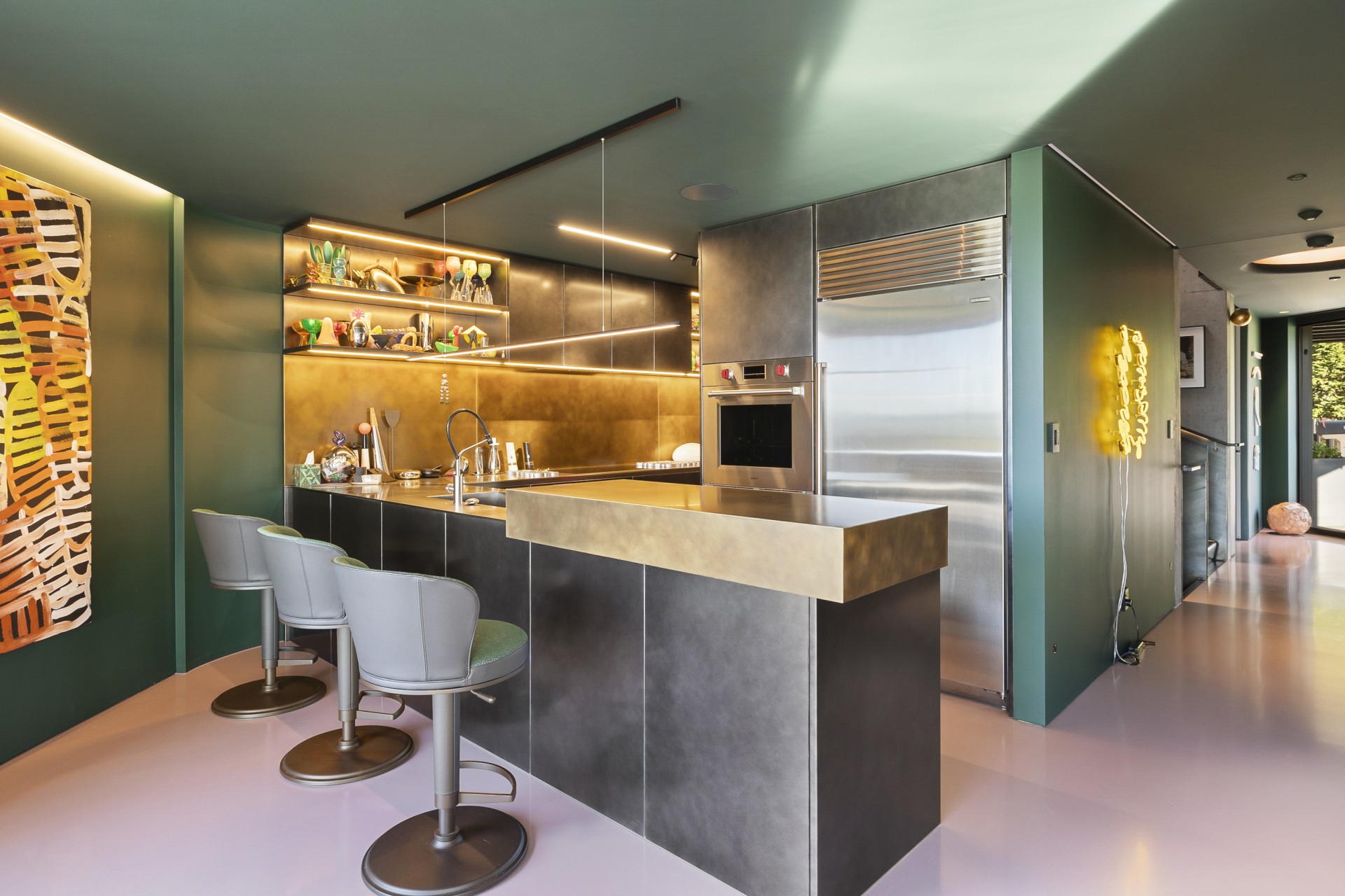
A successful scheme rarely turns on one colour. It turns on a pair, or a small family, where the support holds the lead in place. A deep forest green on a feature wall reads sophisticated against a warm, chalky off-white, and slightly muddy against a cold optical white. The hero has not changed. The supporting tone has decided what the hero is.
Images by: Build and Renovate
Picking the second colour is mostly about temperature and saturation, not hue. Most rooms are forgiving of a strong colour if the supporting tone shares the warmth or coolness of the hero, warm with warm, cool with cool. A dusty terracotta sits naturally next to a creamy stone-toned trim. A smoky teal asks for a cool, slightly grey-leaning trim rather than a yellow-based white. Drop a warm white next to a cool wall and the trim immediately reads dirty. Drop a cool white next to a warm wall and the trim reads blue. Either is fixable in software. Neither is fixable cheaply once the room is painted.
Another move is to repeat the supporting tone somewhere unexpected. A trim colour picked up in a kitchen cabinet front, a hallway runner, the underside of a shelf, ties the room together without anyone consciously seeing why. Designers describe this as carrying the colour through a room. Owners feel it as the room just working.
When you next stand in front of the fan deck, pick two strips, not one. Take them home, hold them against the floor in the morning and against the curtains at dusk, and look at the relationship between them more than at either swatch on its own. Better still, brush an A3 patch of each onto a piece of card and move it around the room. Testpot and peel-and-stick samples read more honestly at scale than a fan strip ever will.
Images by: Build and Renovate
Light matters as much as colour itself. The same pairing that feels balanced in a south-facing room can look harsh in strong western light or flat under cool LEDs. This is why designers test colours at different times of day rather than under shop lighting alone. Natural light shifts undertones constantly. A trim that feels soft and warm in the morning may read yellow by evening, while cooler tones often sharpen as daylight fades.
The hero will sell itself. The second-best colour is the decision worth taking time on, and the one most likely to make the room you walk into a year later still feel right.
McKenzie & Willis Interior Design Award, House of the Year 2023, W Hamilton Building